Looking to choose a colour palette for your brand or business and not sure where to start?
It’s something a lot of our clients feel unsure about. A brand designer will help guide you on colour psychology, and how to stand out from your competitors, but they will likely still ask you what colours you are most drawn to as a starting point. We feel your brand works best when it matches the personality of your business – and if you are a small business, and you’re often the face of it too – so your brand colours are likely to tie into your own personality.
When you’re thinking about your colours, consider the following:
- What colours are you instinctively drawn to? These might also be colours you like to wear or have around your home.
- What adjectives or values describe your brand? Are you earthy, calm, energetic, funky, bold, or sleek? What colours convey these traits? A designer will likely draw on colour psychology to help answer some of these questions. You can do your own research online to see what colours feel like the best ‘personality fit’.
- What other colours are being used in your industry? You might not choose the same ones (in fact, you might go the opposite to stand out), but it’s important to know what colour associations already exist in the minds of your audience).
- Are there any colour associations with your actual business name (for example Moulin Rouge, Blue Steel, or Wild Honey)?
- Are there any other brands you want to feel aligned too? For example, is your business a branch of a larger company or chain? Having some of the same colours will give you a visual link.
- If you’re rebranding rather than starting from scratch, you’ll want to consider the colours you are already known for. You might like to hold on to one or two main colours, so your audience can still recognise you even if you’re making changes to logos, other colours and/or elements of your branding.
So, how does this all come together for an actual brand?
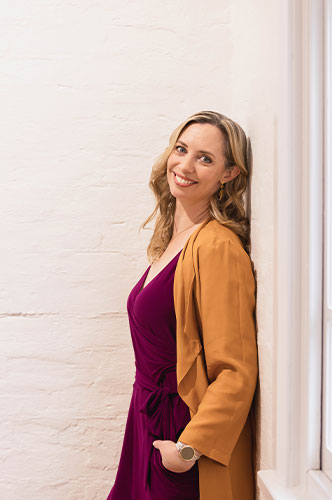
Let’s use Wild Honey Creative as an example… My favourite colour is a bright golden honey or turmeric tone – which also sounds like an excellent winter beverage! I wear quite a lot of this colour, and other brights. With our business name being ‘Wild Honey Creative’, it makes sense that we use those favourite honey-coloured tones as they will help reinforce our name and make it more memorable. But there’s also another layer to it. Golden tones trigger feelings of joy, creativity, happiness, optimism, energy, and warmth… and those feelings also match our Wild Honey Creative brand personality and our values.
NEXT STEPS
Once you’ve worked this out, you’ll want to play around with finding 5 – 7 colours that reflect the above. This is usually 1 – 2 main colours, 2 neutral colours, and up to three other colours that can be used as accents and pops. Within those, you want at least one bright colour that can be used to catch attention and at least one dark colour for text (and this doesn’t have to be black). Make sure you have a good amount of contract between your light and dark tones so you can layer them over the top of each other.
Place your top choices near each other – do they all have a similar level of brightness, vibrancy or saturation? Do they complement each other? Would you wear them all together in a fabulous Gorman print? Is there variety, light and shade, and that all-important pop or contrast?
If you can answer yes to these you may have yourself a winning colour palette.
What if you feel like a change?
It’s natural to want to change your brand colours from time to time (goodness knows I’ve changed my hair colour more times than I’ve watched a Marvel Movie). As long as the change aligns with your brand strategy and values – and helps you reach your audience – it can be a great way to refresh the brand and bring it in line with more modern design approaches. But, I wouldn’t suggest changing ‘just because’ (or every time you fall in love with a pretty Mood Board someone posted on Instagram). Always go back to your brand values, and make sure any change is grounded in strategy.
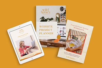
We’ve recently had a little makeover here at WHC, and along with refreshing our typography and creating some new variations of our logo, we’ve amped up the brightness in our colour palette. We felt that adding some extra brightness was more reflective of our fun nature and our creativity and confidence when it comes to design – that little bit of wildness that makes us Wild Honeys.
To wrap up...
All your colours need to work well together, hit on that sweet spot that represents you and calls out to your audience, AND be practical to use.
Let me know if this has been helpful for you – or book a Discovery Call if you’d like to chat about creating your colour palette as part of our Signature Brand Packages.